© - Content and images in this blog are copyright North Design Co. unless stated otherwise. Feel free to repost or share images for non-commercial purpose, but please make sure to link back to this website and its original post.
℗ - We do not store any information about your visit to our website other than for analytics and optimization for content and reading experience through the use of cookies.
℅ - Our site does at times contain paid advertisements, sponsored content, and/or affiliate links. We never share about anything we don't personally use and love.
8 Website Essentials to Turn Browsers into Buyers
free Download
I'm Michaela
Owner // Lead Designer
I love working with ambitious business owners who have a burning desire to take their business to the next level. I would love to help you achieve your goals through my strategic approach to thoughtfully crafted designs.
We’re so excited to share this Wyoming website design today that we worked on earlier this year for Harding Ranch. This project came out even better than we hoped, and the Hardings were thrilled with the results. So today we’re breaking down our process for this project and all of the details to give you a little BTS moment!
Table of Contents
ToggleHarding Ranch
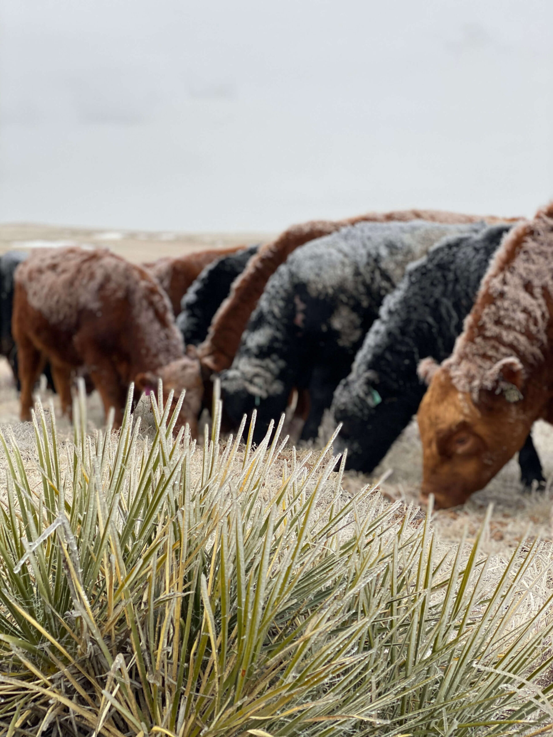
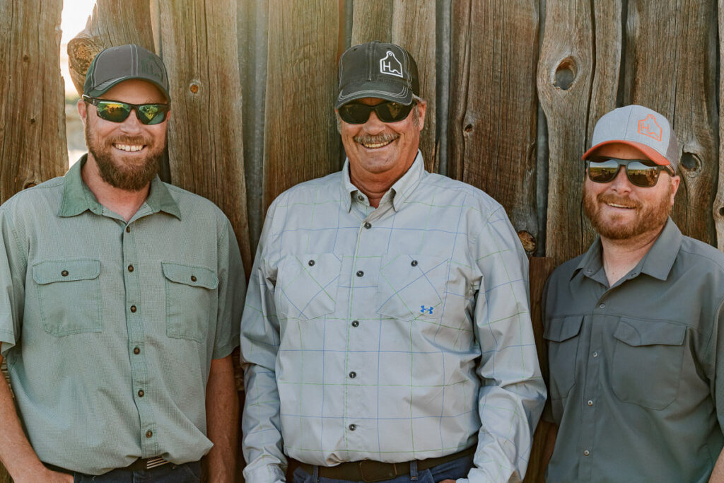
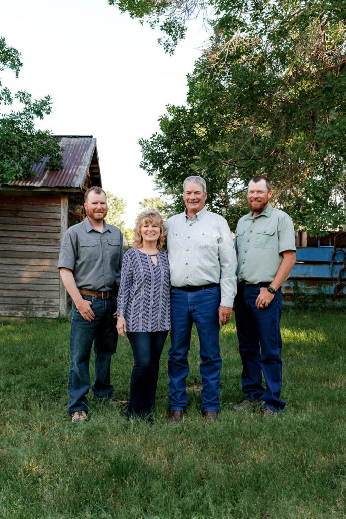
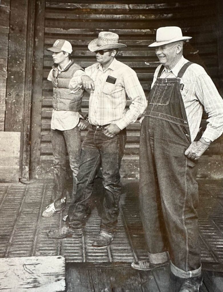
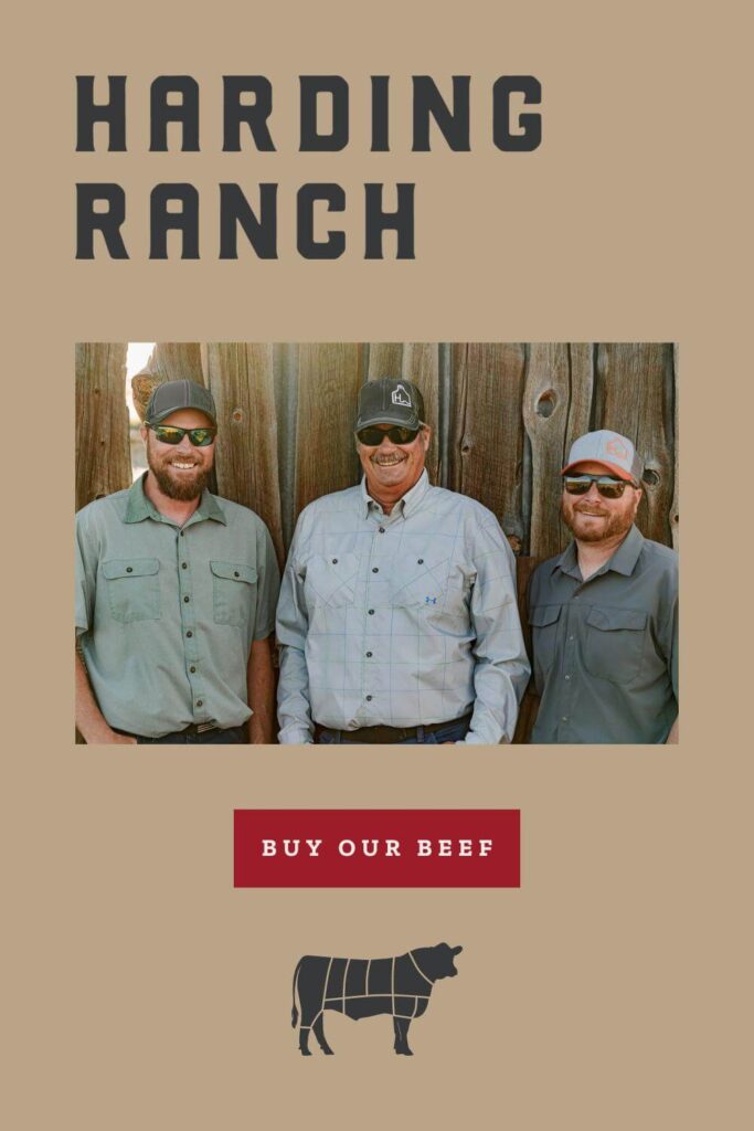
The Harding family has a deep history of ranching here in Wyoming, dating back to 1916. Most recently, Jerry Harding and sons Jerrod and Kiel went off on their own in 2020 in order to grow the cow-calf operation and retail beef side of the business.
Over the last few years, their sales grew consistently, despite not even having an online presence. They did have a logo design, but minimal branding, and Kiel was doing the bulk of their sales through word of mouth and social media.
They really wanted to be able to take things to the next level, however. When Kiel reached out to us he was ready for Harding Ranch to have a website where people could go to learn more about the ranch and how to purchase their beef. He was also ready to stop having to hustle so much on social media!
A Wyoming Website Design Project
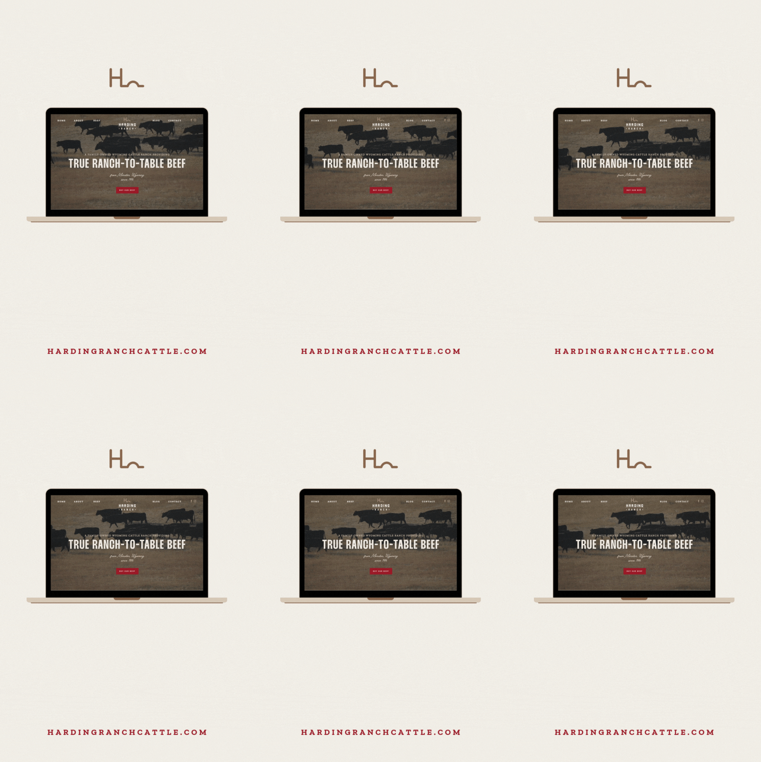
The main goal of this website design project was for Harding Ranch to have an online presence where people could learn about the ranch, their practices, and how they are different from other local competitors. It also needed to show how affordable it can be to purchase beef directly from a ranch versus buying it at a grocery store. The Hardings sell ethically raised, true ranch-to-table beef, and that needed to be super clear on their website.
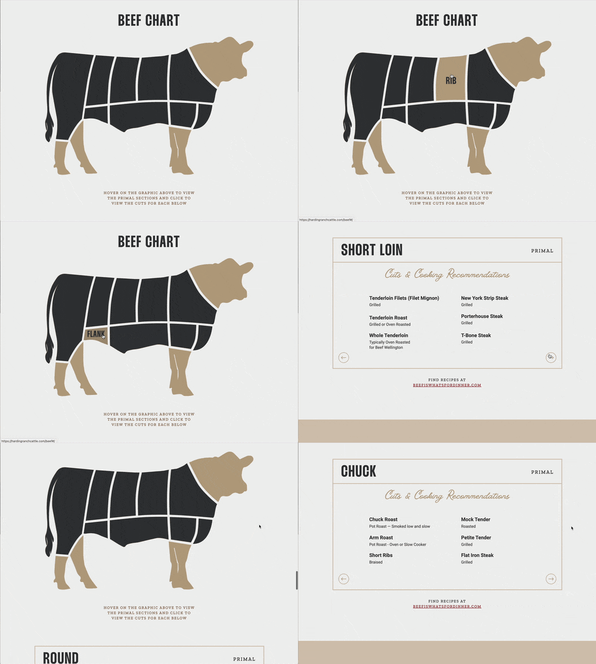
As part of their project, we developed a resource for folks to learn about the different cuts of beef, where they come from on the animal, and cooking recommendations for each. The resource also displays how much of each cut the purchaser will receive with a quarter, half, and whole beef. This resource is really helpful for someone new to purchasing bulk beef and is highlighted on this page of their website.
Brand Design
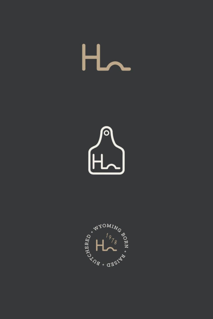
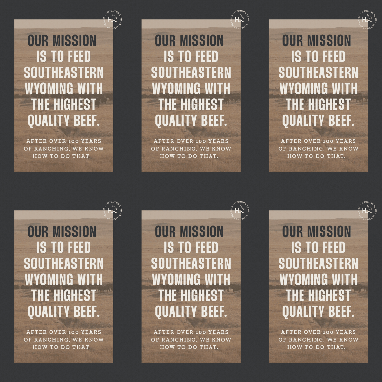
When we began this project, The Hardings already had some basic branding elements, mainly a logo. So we expanded upon this to include additional brand marks, a color palette, and font selections to really make the website stand out. This also helped to create consistency between their website and socials. We developed a font stack that spoke to the vintage element of their brand (they’ve been ranching for over 100 years!), as well as to their authority in the industry.
[Looking for more local Wyoming brand design inspiration? Check out this project we did for bar and grill, The Office.]
The Results
Our favorite part about this project for Harding Ranch was the immediate results that they saw after launching.
For the project, Kiel opted to invest not only in brand and web design, but also in full-service copywriting with our copywriter Rise Copy Co. Writing about your own business can be really challenging, and having professionally-written copy allows your site to convert visitors (that your visual branding attracts) into paying customers.
Investing in branding, web design, AND copywriting proved to be a winning combo for Kiel and the Hardings – their investment paid for itself in beef sales on launch day.
Between the visual elements and the written copy, the Hardings’ unique differentiators – their value system, deep knowledge of ranching through decades of experience, and ethical practices really shine on their new website.
So much so, in fact, that IMI Global discovered the new Harding Ranch site on a Google search (this is the power of SEO!), and reached out. They ultimately;
- Purchased Harding Ranch beef for an IMI Global summit event,
- Connected 3 of their employees with Harding Ranch for beef sales after the event,
- And added Harding Ranch to a very small list of IMI Global producers.
Incredible results! 🤯🤯
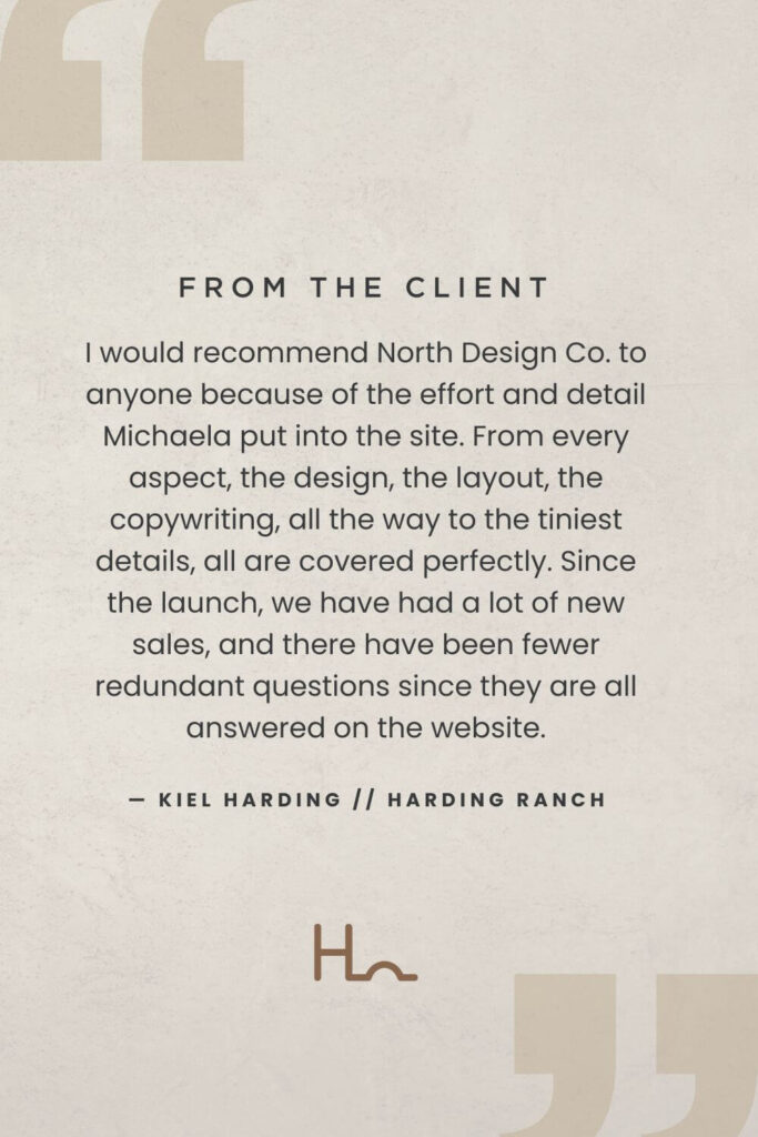
“I would recommend North Design Co. to anyone because of the effort and detail Michaela put into the site. From every aspect, the design, the layout, the copywriting, all the way to the tiniest details, all are covered perfectly. Since the launch, we have had a lot of new sales, and there have been fewer redundant questions since they are all answered on the website.” – Kiel Harding
More Wyoming Website Design Projects
We are so excited for the Hardings and their new website! And for all of the growth that their business will no doubt continue to see.
If you’re looking for more website design inspiration, check out our portfolio of past projects. It’s a curated collection of work in various industries. We always say – our design style is whatever will attract YOUR dream client.
next post
prev post
serving clients Worldwide
@northdesignco
Affiliate Program
a boutique design studio serving ambitious brands
Designing with love from Wyoming
Site Credit | Privacy | Terms | Disclaimer
© North Design Company, LLC. All rights reserved.
Website Templates
Semi-Custom Brands
Showit Website Templates
est. 2020
Based in Cheyenne, WY
The designer behind the screen — passionate for helping guide your business to create the life you've always dreamed about.
est. 2020
Based in Cheyenne, WY
get to know me →
Semi-Custom Brands
Showit Website Templates
est. 2020
Based in Cheyenne, WY
